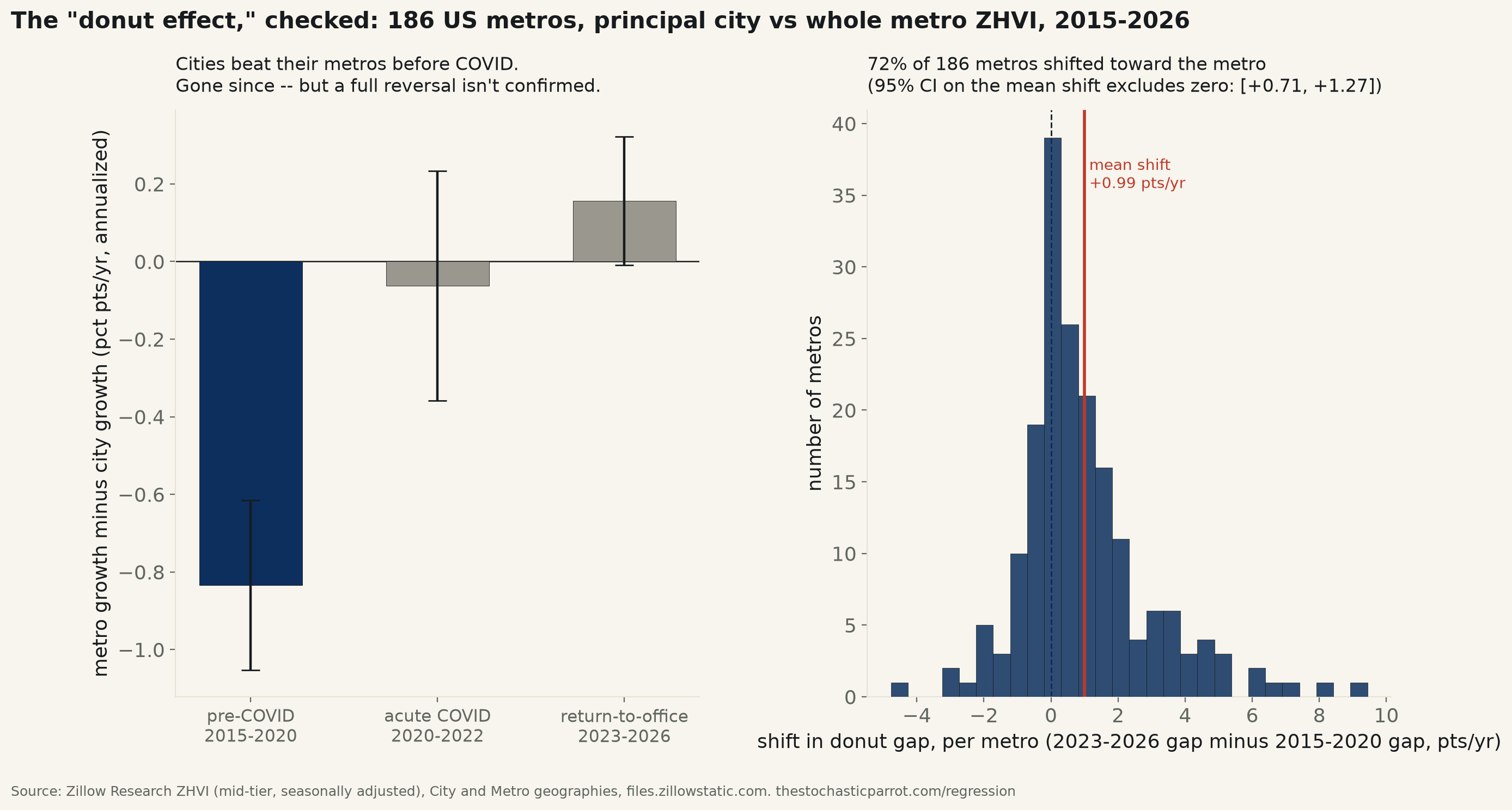
186 US metro areas matched to their own principal city. Before COVID, cities out-grew their own metros by 0.83 points/year (95% CI excludes zero) — a real urban-revival premium. That premium collapsed with COVID (shift of +0.77 points, CI excludes zero) and hasn't moved again since — the "donut" itself, metro out-growing city, still isn't confirmed even in 2023-26.
Ramani & Bloom's "The Donut Effect" (Stanford, 2021) argued that remote work let 2020-21 homebuyers trade a downtown premium for suburban square footage — so home values in city centers should have lagged their own metro-wide average once COVID hit. That paper's window closed in 2021. This run reruns the comparison through 2026, on real Zillow Home Value Index data (mid-tier, seasonally adjusted), for 186 US metro areas — not a hand-picked list of "downtown" ZIP codes, but every metro whose Zillow-published name ("<city>, ST") matches an actual City-level ZHVI series by name and state. The join is code, not curation: 186 of the top 200 metros by population matched cleanly.
For each metro-city pair, annualized growth is an OLS trend on log(ZHVI) inside three windows: pre-COVID (2015-01 to 2020-02, a baseline chosen to clear the 2008-12 crash years), acute COVID (2020-03 to 2022-12, the remote-work shock Ramani & Bloom actually studied), and return-to-office (2023-01 to 2026-07, four years the original paper never saw). The "donut gap" in each window is metro growth minus city growth, in annualized percentage points — positive means the suburbs out-grew their own downtown, the donut's own signature.
Before COVID, the donut ran backward — cities were winning. The pre-2020 gap averages -0.83 points/year, 95% CI [-1.05, -0.62] — excludes zero, p=8.09e-14. Only 27% of the 186 metros even show a positive (donut-shaped) gap pre-COVID; most cities were out-growing their own suburbs, a real urban-revival premium this run did not go looking for.
That premium is gone. The acute-COVID gap averages -0.06 points/year, CI [-0.36, +0.23] — contains zero, p=0.68: cities and their metros grew at statistically indistinguishable rates in 2020-22. The shift from the pre-COVID reading is what clears the bar: +0.77 points, 95% CI [+0.44, +1.11], p=5.8e-06 — a 4,000-draw metro-level bootstrap agrees, CI [+0.45, +1.11]. The confirmed finding is the collapse of the city's edge, not the arrival of a new suburban one.
Four years into "return to office," it hasn't moved again — and still isn't a confirmed donut. 2023-26's gap averages +0.16 points/year, CI [-0.01, +0.32] — the interval very nearly excludes zero (p=0.064) but does not, by 0.009 of a point. A direct test of whether the gap kept moving after the acute shock — recent minus acute — also contains zero: +0.22 points, CI [-0.14, +0.58], p=0.23. Four years of "return to office" headlines have not produced a statistically confirmed further move in either direction; the honest read is a level shift in 2020 that has since held flat. Measured against the pre-COVID baseline the net move is real (+0.99 points, CI [+0.71, +1.27], p=7.9e-12), and by 2023-26, 59% of metros now show a positive gap, up from 27% before COVID — but "more metros lean donut-shaped now" and "the donut effect is statistically confirmed today" are different claims, and only the first one clears this desk's bar.
The extremes, named. Detroit, Philadelphia, Washington and Cleveland show the largest shifts toward their suburbs (+8.02, +6.97, +6.05, +5.23 points respectively) — each was a city that had been meaningfully outrunning its own metro before 2020 and has since given that edge back. Miami and San Francisco moved the opposite way, their own downtowns pulling further ahead of their metros since COVID (-4.77 and -2.87 points) — a reminder that "the donut effect" is an average over 186 very different local housing markets, not a law every city obeys.
Acute-vs-pre shift: n=186, mean +0.77 pts, CI [+0.44, +1.11], p=5.82e-06. Recent-vs-acute (fade test): mean +0.22 pts, CI [-0.14, +0.58], p=0.23. Recent-vs-pre (net effect): mean +0.99 pts, CI [+0.71, +1.27], p=7.89e-12. Share of metros with a positive (donut-shaped) gap: 27% pre-COVID → 48% acute → 59% recent.
Formal single-equation cross-check (the window-averaged paired tests above are the headline; this is an independent confirmation at monthly, not window-averaged, resolution): pooling every metro-month's own log-return spread (metro minus city, in percentage points) across the full 2015-01–2026-07 panel and regressing it on a single post-COVID (2020-03+) dummy, clustered by metro — 38,160 metro-months, 120 metros with complete monthly coverage (fewer than the 186 used in the window-averaged tests, which only require completeness inside each of the three windows separately, not every month straight through) — returns a post-COVID coefficient of +0.0252 points/month (+0.30 points/year equivalent, pooling the acute and return-to-office eras together rather than splitting them), R²=0.00144, 95% CI [+0.0044, +0.0460], p=0.018 — excludes zero, agreeing in direction with the window-averaged shift while confirming it is not an artifact of how the three windows were cut.
| Metro | Shift, pts/yr (2023-26 vs 2015-20) | Pre-COVID gap | 2023-26 gap |
|---|---|---|---|
| Jackson, MS | +9.44 | -2.37 | +7.07 |
| Detroit, MI | +8.02 | -5.16 | +2.86 |
| Philadelphia, PA | +6.97 | -5.11 | +1.86 |
| Bridgeport, CT | +6.39 | -7.28 | -0.88 |
| Reading, PA | +6.17 | -7.02 | -0.84 |
| Washington, DC | +6.05 | -1.14 | +4.91 |
| Buffalo, NY | +5.37 | -5.34 | +0.03 |
| Cleveland, OH | +5.23 | -3.48 | +1.75 |
| Miami, FL | -4.77 | +2.71 | -2.05 |
| San Francisco, CA | -2.87 | +1.74 | -1.13 |
| Huntington, WV | -2.87 | -0.31 | -3.18 |
| Scranton, PA | -2.69 | +0.95 | -1.74 |
| Salisbury, MD | -2.14 | -0.64 | -2.78 |
| San Luis Obispo, CA | -1.87 | +0.72 | -1.16 |
| Daphne, AL | -1.87 | +1.34 | -0.53 |
| Tuscaloosa, AL | -1.80 | +0.54 | -1.26 |
Method. Zillow Research ZHVI, mid-tier (33rd-67th percentile), single-family + condo, smoothed and seasonally adjusted, monthly, 2015-01 to 2026-07. Two geographies: City (one row per US municipality) and Metro (one row per metro area). Every one of the top 200 metros by Zillow's own SizeRank is joined to a City row by exact string match on Zillow's own metro-name format, "<principal city>, <state abbreviation>" — 186 matched with no missing months in any of the three windows and no manual curation of which ZIP codes count as "downtown." Per pair, annualized growth in each window is the slope of an OLS fit of log(ZHVI) on time in years, so a single volatile month cannot swing the estimate the way an endpoint-to-endpoint calculation would. donut_gap = metro's annualized growth minus its own city's, in percentage points; a paired design (each metro is compared only to itself across eras) removes any need to model why Miami and Detroit have different baseline appreciation rates.
Limits, stated plainly. "Principal city" boundaries are municipal, not a distance-to-downtown measure — a large-area Sun Belt city (Houston, Phoenix) contains plenty of low-density suburban-style housing inside its own city limits, which would mute any true center-vs-periphery effect relative to a small, dense legacy city (Boston, Newark) where the municipal boundary tracks the urban core closely. Ramani & Bloom's original design used distance from the central business district within each metro; this run substitutes municipal boundaries because they are what Zillow publishes without additional geocoding, and states that substitution here rather than presenting it as identical. The mid-tier ZHVI excludes the top and bottom price thirds of each market, so this cannot speak to luxury downtown condos or the lowest-cost housing stock specifically. All growth rates are nominal, not inflation-adjusted, though inflation is common to both sides of every paired comparison and mostly cancels in the gap.
donut_metro_536.csv · donut_city_536.csv · donut_pairs_536.csv · fit output (JSON) · table above shows the 8 metros that shifted most toward their metro and the 8 that shifted most toward their city.