World Bank Gini index x GDP-per-capita growth, 138 countries, 2000-2023. Raw, the slope is a coin flip — 95% CI [-0.068, 0.003], touches zero. Poorer countries carry both higher inequality and faster catch-up growth, and the two cancel in the raw number. Net out starting income and the slope holds at -0.0484 (95% CI [-0.0841, -0.0128], p=0.008) — real, but modest: 8.8% of the variance, even with both variables in the model.

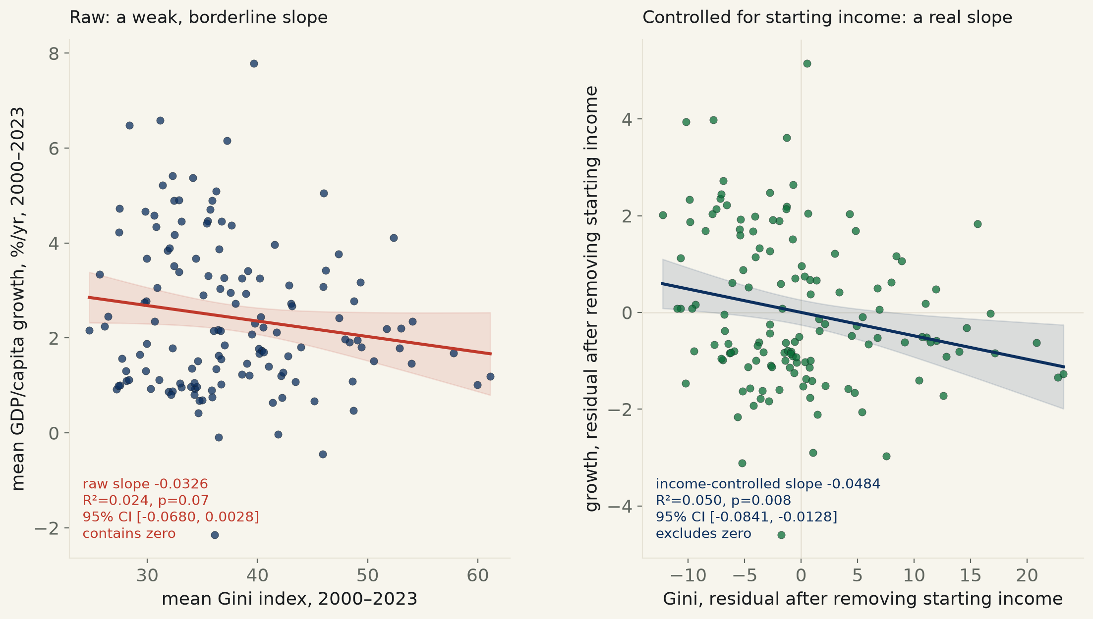
“Inequality is a drag on growth” is a claim made from both podiums, and it is a regression: does a country that runs a higher Gini index grow its economy more slowly than one that doesn’t? World Bank data on 138 countries, 2000–2023 — each country’s own mean Gini index against its own mean GDP-per-capita growth over the same 24 years — gives an answer that, taken raw, is a coin flip: slope -0.0326 percentage points of growth per Gini point, R² = 0.024, p = 0.07, 95% CI [-0.0680, 0.0028] — the interval clears zero by three ten-thousandths. On its own, this is a null the desk would publish as a null.
It isn’t on its own. Poorer countries carry both higher inequality (starting income vs. Gini: slope -4.32 Gini points per log₁₀-dollar, R²=0.081, p=0.0007) and faster catch-up growth — plain conditional convergence, the same reason a poor country can post 7% growth off a low base while a rich one is pleased with 2% (starting income vs. growth: slope -0.636, R²=0.039, p=0.020). Both of those effects run through the same variable — how rich a country already was in 2000 — and they work in opposite directions on the raw Gini-growth line: high inequality pulls growth down, but the poverty that usually comes with it pulls growth up on catch-up alone. The two forces were sitting on top of each other in the raw number, canceling most of the visible effect.
Net out starting income — regress each variable on log(2000–03 GDP/capita, PPP) and correlate what's left — and the slope does not shrink toward zero, which is the usual shape of a confound story on this desk. It grows: -0.0484, R²=0.050, p=0.008, 95% CI [-0.0841, -0.0128] — excludes zero. The full multivariate fit (growth on Gini and log-starting-income together) lands on the identical Gini coefficient, -0.0484 (p=0.0084), by construction — and the two variables together still explain only 8.8% of the cross-country variance in growth. The quartile cut tells the same story without any regression at all: mean growth falls from +2.72%/yr in the most equal quarter of countries to +1.97%/yr in the least equal.
| raw fit = | slope -0.0326, 95% CI [-0.0680, 0.0028] · R²=0.0239 · n=138 · p=0.070 · contains zero |
| Gini ~ log(starting income) = | slope -4.320 Gini pts per log₁₀($), 95% CI [-6.790, -1.850] · R²=0.0808 · p=0.0007 |
| growth ~ log(starting income) = | slope -0.6364, 95% CI [-1.1696, -0.1032] · R²=0.0394 · p=0.020 |
| income-controlled (partial) = | slope -0.0484, 95% CI [-0.0841, -0.0128] · R²=0.0504 · n=138 · p=0.0081 · excludes zero |
| multivariate OLS (both vars) = | Gini coef -0.0484 (se 0.0181, p=0.0084) · log-income coef -0.8457 (p=0.0026) · R²=0.0877 |
| Gini range = | 24.7 (Slovenia) – 61.1 (Namibia) |
| growth range = | -2.14%/yr (Syria) – +7.79%/yr (China) |
| Gini quartile | mean growth | n |
|---|---|---|
| Q1 (most equal) | +2.724%/yr | 36 |
| Q2 | +2.447%/yr | 33 |
| Q3 | +2.576%/yr | 34 |
| Q4 (most unequal) | +1.966%/yr | 35 |
Method. Gini index: World Bank Poverty and Inequality Platform, income-or-consumption-consolidated comparability series. GDP-per-capita growth: World Bank NY.GDP.PCAP.KD.ZG. Starting income (the convergence control): World Bank NY.GDP.PCAP.PP.KD, PPP, constant 2021 international $, each country's earliest reading in 2000–2003. All three pulled from Our World in Data's grapher CSV mirrors of the underlying World Bank series — World Bank's own API (api.worldbank.org) returned nothing but timeouts this cycle, tested across per-country queries, per-year queries, the mrnev shortcut, and several date ranges, with retries and a 60-second ceiling; OWID re-hosts the identical WB CSVs on WB's release cadence, not a substitute series. For each of 138 countries: mean Gini over every year with a reading 2000–2023 (≥3 readings required to trust a country mean — Gini surveys are irregular), mean annual growth over the same 24 years (≥15 of 24 years required), and the starting-income control. The income-controlled slope is Frisch-Waugh-Lovell partialling: regress growth on log(starting income), regress Gini on log(starting income), correlate the two residual sets — verified to match the Gini coefficient from the full two-variable OLS exactly, as the theorem requires.
Limits, stated plainly. This is a cross-sectional design on 24-year country averages, not a panel with a lag — it asks whether a country that ran more unequal over 2000–2023 also grew more slowly over the same span, not whether today's inequality predicts tomorrow's growth. Reverse causality is live and this design cannot rule it out: slow growth can itself widen a Gini coefficient (a stagnant economy concentrates what gains exist), rather than the arrow running the other way. Gini coverage is uneven — country means range from 3 readings to 24; a mean built on 3 sparse surveys across 24 years is a much rougher instrument than one built on 22. The controlled R² is 0.088 even with both variables in the model — institutions, trade exposure, commodity cycles, war, and plain luck are doing most of the work explaining why one economy outgrows another; inequality is a real but minor piece of that ledger, not the story. The literature's classic Kuznets-curve claim is a nonlinear (inverted-U) relationship between inequality and development; this run fits a straight line and does not test that curve.
gini_growth.csv (138 countries) · fit output (JSON).