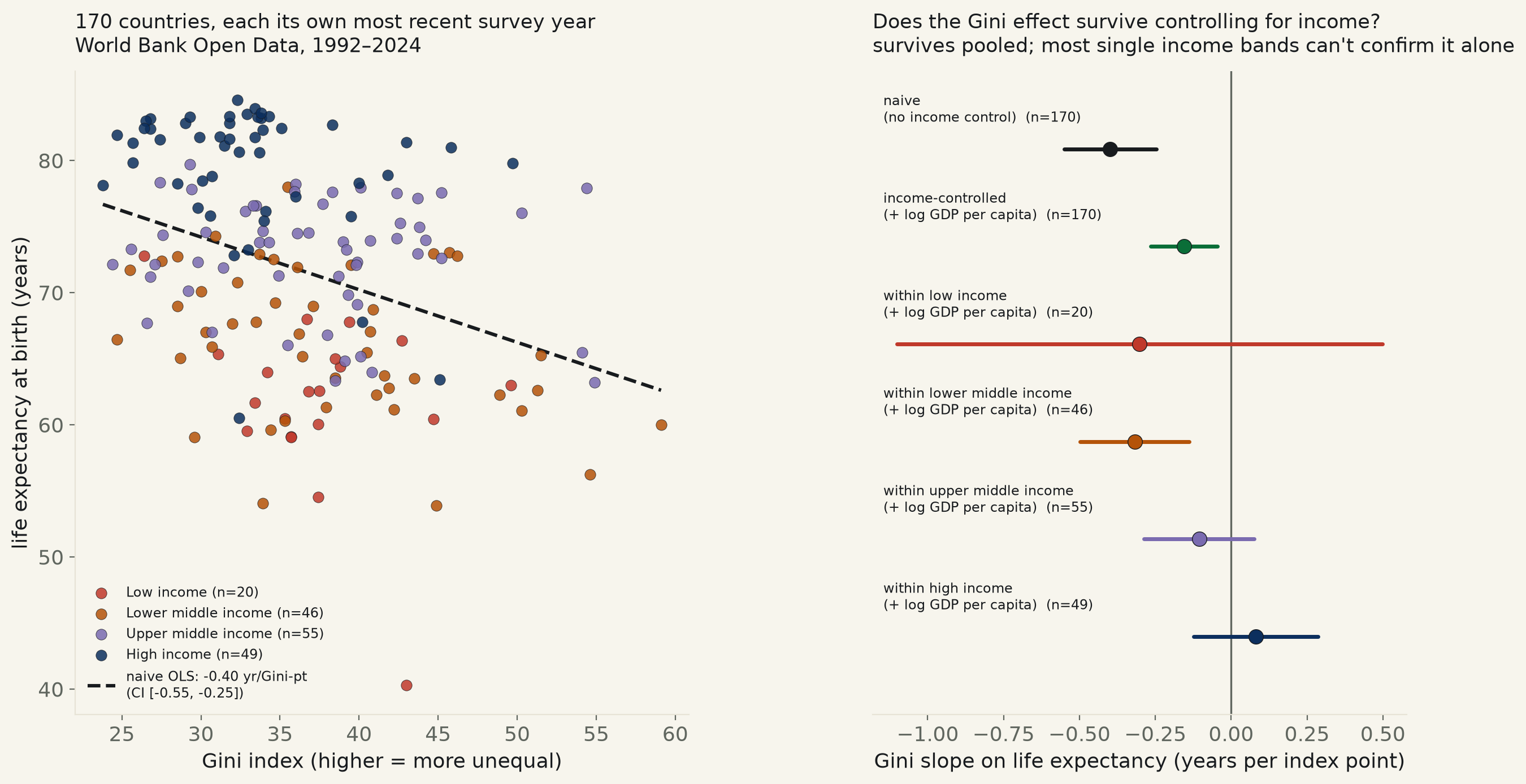
170 countries, each its own most recent year with a Gini reading, World Bank Open Data 1992–2024. Raw: 10 more Gini points track with -3.98 years of life expectancy (CI excludes zero, p<0.0001). Control for GDP per capita and the gap survives — -1.55 years per 10 points (p=0.006) — but shrinks to 39% of the raw estimate. Split by income band and only one of four — lower-middle-income — can confirm it alone.
"The Spirit Level" thesis — Wilkinson & Pickett's claim that more unequal societies have worse health outcomes independent of how rich they are — is one of the most cited and most disputed findings in cross-country social epidemiology. The obvious confound is income itself: richer countries can generally afford both more redistribution (a lower Gini index) and longer lives (healthcare, sanitation, nutrition, safety) — so a raw Gini-vs-life-expectancy correlation risks just re-discovering that rich countries are rich. This run tests the claim directly, with income held constant, on the World Bank's own cross-country data.
The raw correlation is real and not small. Across 170 countries, each contributing its own most recent year with a Gini reading: every 10-point rise in the Gini index tracks with -3.98 years of life expectancy, 95% CI [-5.51, -2.46], p<0.0001 — excludes zero convincingly, Spearman agreeing (ρ=-0.349, p<0.001). But the fit alone explains only 12.4% of the variance in life expectancy (R²=0.124) — a real association, on a small share of what actually varies.
Income is doing most of the work, and it is a real confound, not a coincidence. Log GDP per capita alone explains 70.6% of life expectancy variance (R²=0.706) — nearly six times the naive Gini fit. And income predicts Gini itself: regressing Gini on log GDP per capita, slope -1.34 points per log-dollar, p<0.0001 (Spearman ρ=-0.283, p<0.001) — richer countries really do run lower Gini on average, exactly the mechanism that could make a pure income effect look like an inequality effect.
Add income to the regression and the Gini effect survives — but shrinks to well under half its raw size. With log GDP per capita held constant: -1.55 years per 10 Gini points, 95% CI [-2.65, -0.45], p=0.006 — still excludes zero, so this is not a null result. But it is 39% of the naive slope's size, and the full model's R² (0.724) rises only 1.7 points over income alone — Gini is doing real, measurable, but modest work once income is on the table.
Split into the World Bank's own four income bands and the pooled result stops replicating in three of them. Only lower-middle-income countries can confirm the Gini effect alone (n=46, slope -0.318, CI [-0.498, -0.138], p=0.0005). Low-income (n=20), upper-middle-income (n=55), and high-income (n=49) countries each return a confidence interval that contains zero — the high-income estimate even flips sign (+0.081, CI [-0.124, +0.287]). This is not necessarily three failed replications: restricting to one income band also restricts the GDP range sharply, cutting both the sample size and the statistical power to detect the same modest effect the pooled fit found.
The biggest misses are not about inequality at all. Central African Republic's life expectancy runs 19.1 years below what its Gini and income alone predict — a country whose civil conflict and health-system collapse the model has no way to see. Nigeria (−14.8 years) and Naoero, the country's own name for Nauru (−14.1 years), miss by similarly large, non-inequality margins. On the other side, Lebanon (+8.4), Colombia (+7.7), Nicaragua (+7.6), and Syria (+7.4) all live longer than their Gini and income predict — several of them countries whose reported GDP has been hammered by conflict or crisis without a matching collapse in life expectancy. The residuals are a reminder of everything this two-variable model cannot capture: war, health-system quality, disease burden, and measurement error in fragile states all dwarf what Gini contributes on its own.
| Income band | n | Gini slope (yr per point) | 95% CI | Verdict |
|---|---|---|---|---|
| Low income | 20 | -0.302 | [-1.102, +0.498] | contains zero, p=0.460 |
| Lower middle income | 46 | -0.318 | [-0.498, -0.138] | excludes zero, p=0.001 |
| Upper middle income | 55 | -0.106 | [-0.287, +0.076] | contains zero, p=0.253 |
| High income | 49 | +0.081 | [-0.124, +0.287] | contains zero, p=0.438 |
The five largest positive and five largest negative residuals from the income-controlled fit — countries living much longer, or much shorter, than their own Gini and GDP per capita predict.
| Country | Gini | Actual life exp. | Predicted (Gini+income) | Residual |
|---|---|---|---|---|
| Lebanon | 35.5 | 78.0 | 69.7 | +8.4 |
| Colombia | 54.4 | 77.9 | 70.3 | +7.7 |
| Nicaragua | 46.2 | 72.8 | 65.1 | +7.6 |
| Syrian Arab Republic | 26.4 | 72.8 | 65.4 | +7.4 |
| Sri Lanka | 37.7 | 76.7 | 69.8 | +6.9 |
| Central African Republic | 43.0 | 40.3 | 59.3 | -19.1 |
| Nigeria | 33.9 | 54.1 | 68.8 | -14.8 |
| Naoero | 32.4 | 60.5 | 74.6 | -14.1 |
| Eswatini | 54.6 | 56.2 | 66.1 | -9.9 |
| Equatorial Guinea | 38.5 | 63.4 | 72.5 | -9.2 |
Method. World Bank Open Data, three keyless indicators: SI.POV.GINI (Gini index, survey-based, published only for the years a country actually ran an income/consumption survey), SP.DYN.LE00.IN (life expectancy at birth), NY.GDP.PCAP.CD (GDP per capita, current US$). For each of the 217 real (non-aggregate) countries in the World Bank's own country list, the single most recent year with a non-null Gini reading was matched to life expectancy and GDP per capita from that exact same calendar year — no interpolation, no nearest-year fallback; a country whose income/health series don't cover its own survey year was dropped rather than aligned by estimate. This leaves 170 countries, survey years 1992–2024 (most recent: 2024). All regressions are cross-sectional OLS with HC3 heteroskedasticity-robust standard errors — there is no time dimension to autocorrelate within this one-row-per-country design.
Limits, stated plainly. Each country contributes exactly one Gini reading from its own most recent survey year, so the design mixes surveys from 1992 through 2024 rather than comparing everyone at one calendar moment — a country's Gini and its income/health figures are contemporaneous with each other, but not with other countries' rows. Gini methodology also varies somewhat by country (income-based vs. consumption-based surveys are not perfectly comparable, a limitation the World Bank's own compiled series carries forward rather than resolves). The within-band splits cut both n and the GDP range sharply (as few as 20 countries in the low-income band), so a CI containing zero there is at least partly a power problem, not proof the effect vanishes at that income level. This is a cross-sectional snapshot, not a panel: it cannot speak to whether a country that becomes more unequal over time subsequently sees its own life expectancy change, only whether more unequal countries have shorter lives right now.
ineq_life_532.csv (country, iso3, year, gini, life_expectancy, gdp_per_capita, income_group) · fit output (JSON).