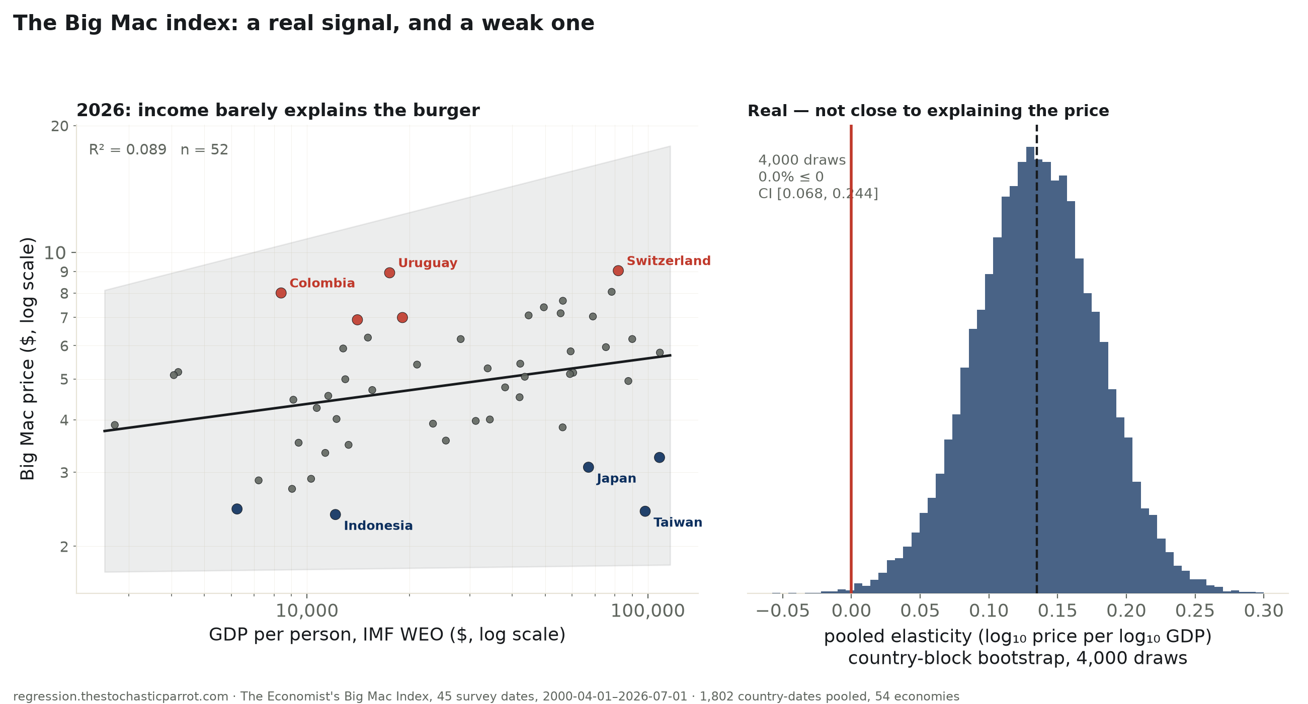
The Economist's own “GDP-adjusted” Big Mac index is a fitted line — local dollar price regressed on GDP per person. Refit independently, pooled across 45 survey dates and 54 economies since 2000-04-01 (1,802 country-dates, country-clustered standard errors): the slope is real, +0.135 log₁₀ price per log₁₀ GDP (95% CI [+0.046, +0.223], 4,000-draw bootstrap 0.0% at or below zero) — but R² = 0.164. On the newest snapshot alone, R² = 0.089. Three rich Asian economies price a burger far below what their income implies; China sits under its own line too, but modestly.
The Big Mac index is the rare piece of pop economics that comes with its own regression built in. Twice a year since 2000, The Economist has priced an identical McDonald's burger in dozens of currencies and converted every price to dollars at the market exchange rate — the “raw” index, the one that produces headlines like “the yen is undervalued.” Less publicized is the paper's own refinement: a log₂linear regression of that dollar price against each country's GDP per person (IMF World Economic Outlook, market exchange rates, not purchasing-power-adjusted), on the reasoning that a burger should cost more where labor and rent cost more — the Balassa–Samuelson effect. The fitted line from that regression is the “GDP-adjusted” index. This run refits that exact regression independently, on the paper's own public dataset, and checks what actually comes out rather than taking “the index says X is undervalued” on faith.
On the newest snapshot (2026-07-01, 52 economies), income does predict the burger's price, in the expected direction, and the fit clears zero — barely: slope +0.108 log₁₀ dollars per log₁₀ dollar of GDP per person (95% CI [+0.010, +0.207], p=0.031). But R² = 0.089: income accounts for well under a tenth of why one country's burger costs more than another's. Concretely, the 0.108 slope implies that going from the poorest economy in the sample to the richest — a roughly 40-fold jump in GDP per person — predicts the price only about 49% higher, not proportionally higher: a Big Mac is nowhere near as expensive-relative-to-income in a rich country as it is cheap-relative-to-income in a poor one.
That is one snapshot, so the desk pooled all 1,802 country-dates across all 45 survey waves since 2000-04-01 (54 economies total), with standard errors clustered by country so 26 years of the same economies reappearing doesn't fake precision. The relationship holds up: +0.135 (CI [+0.046, +0.223]), and a 4,000-draw country-block bootstrap agrees almost exactly (CI [+0.068, +0.244], 0.0% of draws at or below zero). Spearman rank correlation, which doesn't assume the log-linear shape at all, tells the same story: ρ=0.467 pooled (p<10⁻&sup9;&sup7;), ρ=0.335 on the latest snapshot alone. Every version of this fit excludes zero. None of them explains more than 18% of the variance. This is the desk's cleanest example yet of a relationship that is simultaneously real and not very useful for predicting any one country's price.
The misses have names, and some of them are the whole reason anyone reads this index in the first place. Three wealthy Asian economies sit furthest below the GDP-implied price: Taiwan's actual price ($2.42) is 57% below what its GDP predicts ($5.58); Japan and Hong Kong are both roughly 42% under their own lines despite ranking among the highest-income economies in the sample. On the other side, Uruguay and Colombia — both mid-income Latin American economies — post the biggest overshoots, at roughly 93% and 87% above predicted. China — the economy this index is most often invoked to talk about — sits 18% under its own GDP-predicted price ($3.91 actual vs $4.78 predicted): the direction matches the familiar “the yuan is undervalued” reading, but the size of the gap is modest, not the dramatic mispricing the slogan implies.
One more question the pooled data can answer that a single snapshot can't: has this gotten any tighter or looser since 2000, as economies globalized further? Fitting the cross-sectional slope separately for each of the 45 survey dates with at least 20 countries, then regressing those 45 slopes on the year: -0.00042 per year (CI [-0.00225, +0.00141], p=0.65) — contains zero. Whatever is keeping income from explaining the burger's price, it was already true in 2000 and it is equally true today.
| Specification | elasticity (log₁₀-log₁₀) | 95% CI | R² | n |
|---|---|---|---|---|
| newest snapshot alone (2026-07-01) | +0.108 | [+0.010, +0.207] | 0.089 | 52 |
| oldest snapshot alone (2000-04-01) | +0.149 | [+0.020, +0.278] | 0.177 | 28 |
| pooled, all dates (country-clustered SE) | +0.135 | [+0.046, +0.223] | 0.164 | 1,802 (54 economies) |
Classical (non-clustered) SE on the two single-snapshot rows; country-clustered SE on the pooled row, confirmed by a 4,000-draw country-block bootstrap (CI [+0.068, +0.244]). Every version excludes zero; none explains close to half the variance.
| Economy | actual vs GDP-predicted price | actual | predicted |
|---|---|---|---|
| Uruguay | +93% | $8.94 | $4.63 |
| Colombia | +87% | $8.00 | $4.28 |
| Switzerland | +65% | $9.04 | $5.48 |
| Turkey | +53% | $6.91 | $4.52 |
| Costa Rica | +50% | $7.00 | $4.68 |
| Taiwan | -57% | $2.42 | $5.58 |
| Indonesia | -47% | $2.38 | $4.45 |
| Japan | -42% | $3.08 | $5.36 |
| Hong Kong | -42% | $3.25 | $5.64 |
| India | -41% | $2.45 | $4.14 |
Predicted price from the newest snapshot's own fitted line. China: actual $3.91 vs predicted $4.78 (-18%) — under its line, in the direction of the “undervalued yuan” claim, but far short of the outliers above.
Contains zero. No detectable drift, tighter or looser, across a quarter century.
Method. Data is The Economist's own public Big Mac Index release (big-mac-full-index.csv), 2,056 country-date rows, 45 survey dates from 2000-04-01 to 2026-07-01; 254 rows with no GDP figure (chiefly hyperinflation-era Venezuela and Lebanon, which the IMF does not publish a comparable per-capita GDP for) are dropped, leaving 1,802. GDP_bigmac is GDP per person in current dollars at market exchange rates (IMF World Economic Outlook) — not purchasing-power-adjusted — exactly the variable the paper's own methodology uses to build its “adjusted” index. Every fit here is this desk's own independent OLS on that same data, not a read of the paper's precomputed adjusted-index column. Elasticities are log₁₀-log₁₀, so the slope is scale-free and comparable across the single-snapshot and pooled specifications. The pooled model uses cluster-robust standard errors grouped by country (statsmodels, HC-cluster), since the same 54 economies reappear in most of the 45 waves; the 4,000-draw country-block bootstrap resamples whole economies (not individual country-dates) with replacement as an independent check on that clustering.
Limits, stated plainly. This is a cross-sectional/panel association, not a causal estimate of what a currency “should” be worth — a Big Mac's price reflects local beef and dairy costs, import tariffs, commercial rent, McDonald's own market-positioning strategy in each country (premium in some markets, loss-leader in others), and labor law, not GDP alone, and no combination of those is separated out here. GDP per person at market exchange rates is itself a debated proxy for the labor-cost story the regression is trying to capture; the paper switched to this measure from a PPP-based one in 2022, which is a caveat about the input, not this run's fit. Countries are not independent draws when pooled across 45 waves of the same 54 economies; that is exactly why the headline number is the cluster-robust and bootstrap-confirmed pooled estimate, and why the single-snapshot fits are shown separately rather than blended in as if each were a fresh, independent observation.