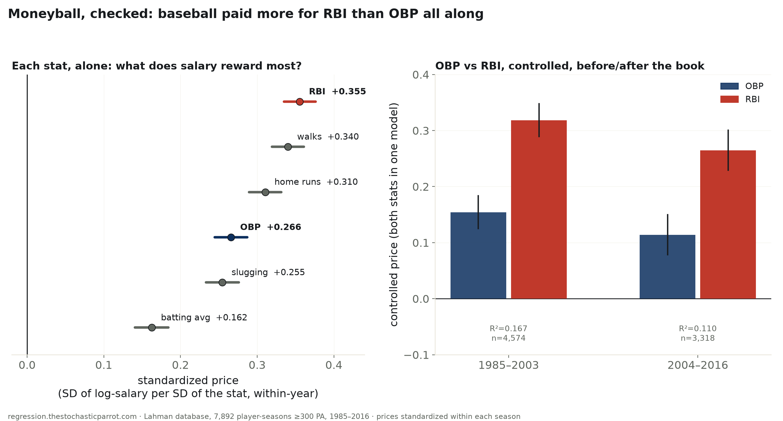
7,892 qualified hitter-seasons (≥300 plate appearances), 1985–2016 — the full span the sport’s own salary database covers. Standardized within its own season, RBI prices highest of six batting stats tested; OBP comes in fifth of six. Controlling for each other, RBI keeps more than double OBP’s price. After the 2003 book, RBI got measurably cheaper — OBP did not get measurably more expensive.
“Moneyball” is the rare sports claim with a specific, checkable shape: before Michael Lewis’s 2003 book, baseball front offices are supposed to have priced hitters on the visible, narrated counting stats — batting average, RBI, home runs — while ignoring on-base percentage, the rate stat that most directly tracks how often a hitter avoids making an out. The Lahman database carries both sides of that trade: a season batting line for every qualifying hitter, and — for 1985–2016, the entire span the sport’s own salary-disclosure database covers before its source was discontinued — what he was paid that year. Joined on player and season, restricted to real everyday seasons (≥300 plate appearances, a bar pitchers’ occasional at-bats never clear on their own), that’s 7,892 player-seasons across 1,494 hitters.
Even the crudest test says OBP was never invisible to the market: raw log-salary regressed on raw OBP alone already clears zero by a wide margin (R²=0.052, p=5.4e-94), on par with RBI (R²=0.111). But raw dollars over 32 years mostly measure salary inflation and career tenure, not what a team pays a player relative to his own season’s field. Every number from here converts both salary and every stat into a z-score against that season’s own qualifiers before fitting anything — comparing a player only to his contemporaries, the way a general manager actually does.
Run six stats one at a time and RBI prices highest of all of them: +0.355 SD of log-salary per SD of RBI (CI [+0.335, +0.376]), ahead of walks (+0.340) and home runs (+0.310). OBP comes in fifth of six, at +0.266 (CI [+0.245, +0.287]) — ahead only of batting average (+0.162). Put OBP and RBI in one model together, controlling for each other, and the gap survives: RBI keeps +0.296 (CI [+0.273, +0.319]), more than double OBP’s +0.137 (CI [+0.114, +0.160]). Add home runs to that model and HR itself adds nothing once RBI is already in it (+0.019, p=0.36) — RBI is not simply riding along on power, it carries its own, separate salary premium.
Push every candidate stat into one kitchen-sink model — OBP, batting average, home runs, RBI, walks, all five at once — and the picture sharpens further. OBP’s own coefficient collapses to statistical noise (-0.010, p=0.77), and so do average (+0.018, p=0.50) and home runs (-0.022, p=0.31). Only two stats keep an independent, significant price once everything else is controlled: RBI (+0.255, p<0.001) and walks (+0.219, p<0.001) — the specific input the on-base-percentage formula actually adds beyond batting average. The market’s real, surviving reward isn’t “OBP” as a rate construct; it’s a hitter’s walk total, which is exactly the plate-discipline signal the book’s Oakland front office said it was chasing — just decomposed one level further than “OBP” as a single number.
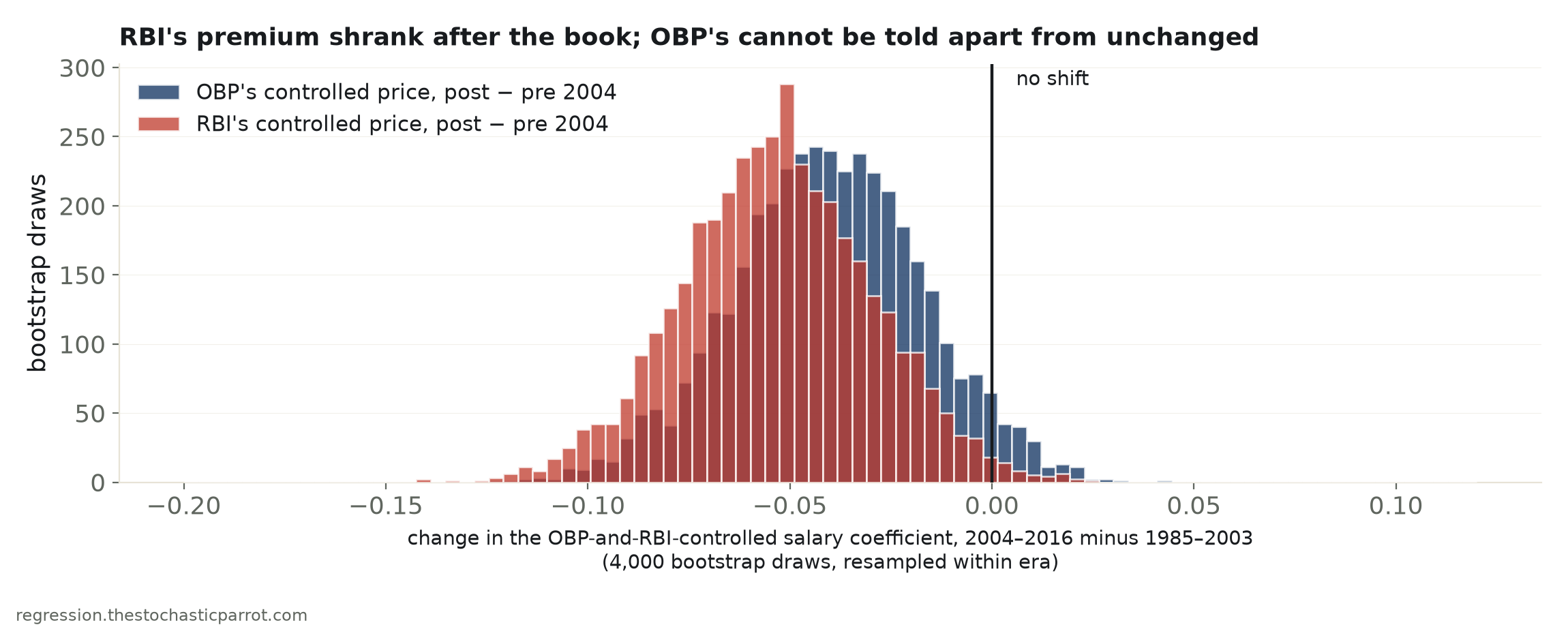
Split at 2004, the first full season after the book: the OBP-and-RBI model in 1985–2003 gives OBP +0.154 and RBI +0.318 (R²=0.167, n=4,574); 2004–2016 gives OBP +0.114 and RBI +0.265 (R²=0.110, n=3,318). A 4,000-draw bootstrap of the shift between the two eras says RBI’s controlled price really did fall — -0.054 (CI [-0.100, -0.007], excludes zero) — but OBP’s point estimate moved almost as much in the same direction and its interval cannot rule out no shift at all (-0.040, CI [-0.088, +0.006]). The popular retelling — the market woke up and started paying for OBP — doesn’t survive contact with the interval. What actually happened is narrower: RBI got measurably cheaper; OBP did not get measurably more expensive. And the model as a whole got worse at its job — R² fell from 0.167 to 0.110 — consistent with a hitter’s pay in a given year increasingly reflecting a multi-year guaranteed contract signed in some other year, not that season’s own stat line; this run has no contract-length data to test that mechanism directly, so it is offered as the likely reason, not a demonstrated one.
The book’s own case study still lands, at the individual level, even though the era-level story doesn’t. Scott Hatteberg’s 2002 season — the one “Moneyball” actually narrates — carried a .374 OBP, the 84th percentile of that year’s 258 qualifiers, on a modest 15 home runs and 61 RBI. His $900,000 salary ranked in the 31th percentile of the same group — a genuine, large gap between his on-field OBP rank and his pay rank, in the exact season the book is about. That one mismatch is real. It just isn’t, on this data, evidence of a market-wide blind spot that a book then closed.
| Stat, alone | standardized price | 95% CI | R² |
|---|---|---|---|
| RBI | +0.355 | [+0.335, +0.376] | 0.126 |
| walks | +0.340 | [+0.319, +0.361] | 0.116 |
| home runs | +0.310 | [+0.290, +0.331] | 0.096 |
| OBP | +0.266 | [+0.245, +0.287] | 0.071 |
| slugging | +0.255 | [+0.233, +0.276] | 0.065 |
| batting average | +0.162 | [+0.141, +0.184] | 0.026 |
Standardized against that season's own qualifiers, so 32 years of salary inflation and shifting league offense cannot manufacture a slope on their own.
OBP is built from hits, walks and hit-by-pitch over plate appearances; once walks sit in the model as their own term, OBP's remaining, walks-independent information carries no separate price.
| Era | OBP, controlled | RBI, controlled | model R² | n |
|---|---|---|---|---|
| 1985–2003 | +0.154 [+0.125, +0.183] | +0.318 [+0.289, +0.348] | 0.167 | 4,574 |
| 2004–2016 | +0.114 [+0.078, +0.150] | +0.265 [+0.229, +0.301] | 0.110 | 3,318 |
Bootstrap (4,000 draws, resampled within era) on the era-to-era shift: RBI's controlled price falls -0.054 (CI [-0.100, -0.007], excludes zero). OBP's falls -0.040 (CI [-0.088, +0.006], contains zero) — not distinguishable from no change.
Both p < 10⁻¹²&sup8;. Agrees with the standardized OLS ordering — not an artifact of the linear-model assumption.
Method. Lahman Baseball Database, maintained release, pulled from the r-universe CSV endpoints of the cdalzell/Lahman R package. Batting summed across in-season stints (a mid-season trade splits a player's line across two rows); Salaries summed the same way (a mid-season trade also splits the pay). The two are joined on player and season and restricted to ≥300 plate appearances — checked directly against the Pitching table rather than assumed: zero of the 7,892 qualifying player-seasons carry any meaningful innings pitched that year, so the PA floor alone does the work of excluding pitchers. Every stat and log-salary are converted to a z-score against that season's own qualifiers before any regression, so a coefficient means “standard deviations of log-salary per standard deviation of the stat, relative to that year's field” — comparable across the whole 32-year window without inflation or era-level offense doing the work.
Limits, stated plainly. Lahman's Salaries table runs 1985–2016 only — its underlying source (USA Today's salary database) was discontinued and no clean public successor has backfilled 2017 onward into this release, so whether the market still misprices anything today is not tested here. This is OLS on what teams actually paid, not a model of what a stat is worth in wins; it is not corrected for arbitration-eligibility or free-agency status, both of which compress a young player's salary far below his output regardless of what teams believe about OBP or RBI, and neither is modeled directly. RBI and home runs are counting stats that scale with playing time and batting-order slot as well as skill; OBP and batting average do not — the multivariate models mix rate and counting stats on purpose, because that is the stat line a front office actually sees, not because they are measuring the same kind of thing. No causal claim is made: this is a description of what the market paid, not of what it should have paid, though the run-value literature this replicates (Hakes & Sauer, “An Economic Evaluation of the Moneyball Hypothesis,” Journal of Economic Perspectives 20:3, 2006) makes exactly that comparison and is the source of the 2004 era-split design used here.