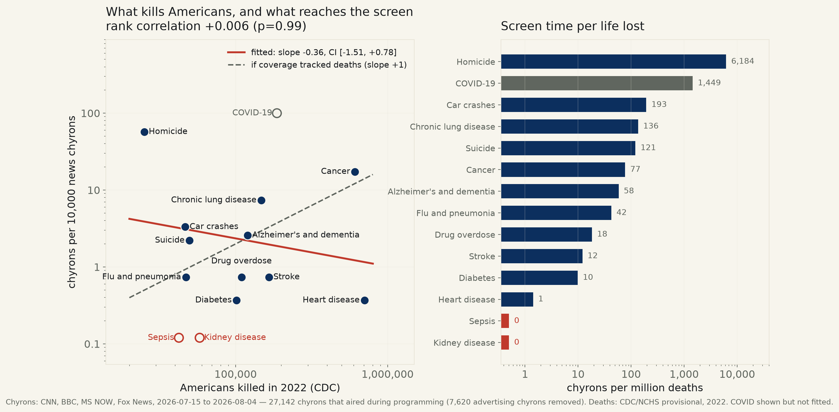
27,142 chyrons that aired during programming on CNN, BBC, MS NOW and Fox News, 2026-07-15 to 2026-08-04, matched against CDC’s own count of what killed Americans. Heart disease killed 704,786 people and reached the screen once. Homicide killed 28× fewer and reached it 155 times. The rank correlation between how many a thing kills and how often it is named is +0.006.
The claim under audit is not one anybody states out loud, which is what makes it worth testing: that a news channel, over a month, gives its attention roughly in proportion to what is actually happening to the people watching. Nobody defends that proposition in those words. Everybody relies on it.
It is testable here because this desk owns the tape. The Media Observatory captures four channels continuously and reads their chyrons — the banners along the bottom of the screen, the closest thing television has to a headline. Between 2026-07-15 and 2026-08-04 it recorded 73,134 of them across CNN, BBC, MS NOW and Fox News. The Observatory also labels every second of tape as programming, advertisement or promo, which matters more than it sounds: cable is saturated with pharmaceutical advertising, and drug advertisements name diseases constantly. Counting them would have credited the networks with health coverage that was purchased. 7,620 advertising chyrons were removed, leaving 27,142 that aired while the channel was doing journalism.
Against that, CDC's own provisional count of what killed Americans in 2022. Fourteen causes, matched to the chyrons by keyword.
Heart disease killed 704,786 Americans. Across four national networks and three weeks it reached a chyron once. Homicide killed 25,065 — 28 times fewer — and reached one 155 times. Per million dead, that is 4,355 times more screen time for the rarer death. Sepsis and kidney disease, between them 100,366 deaths, were not named at all.
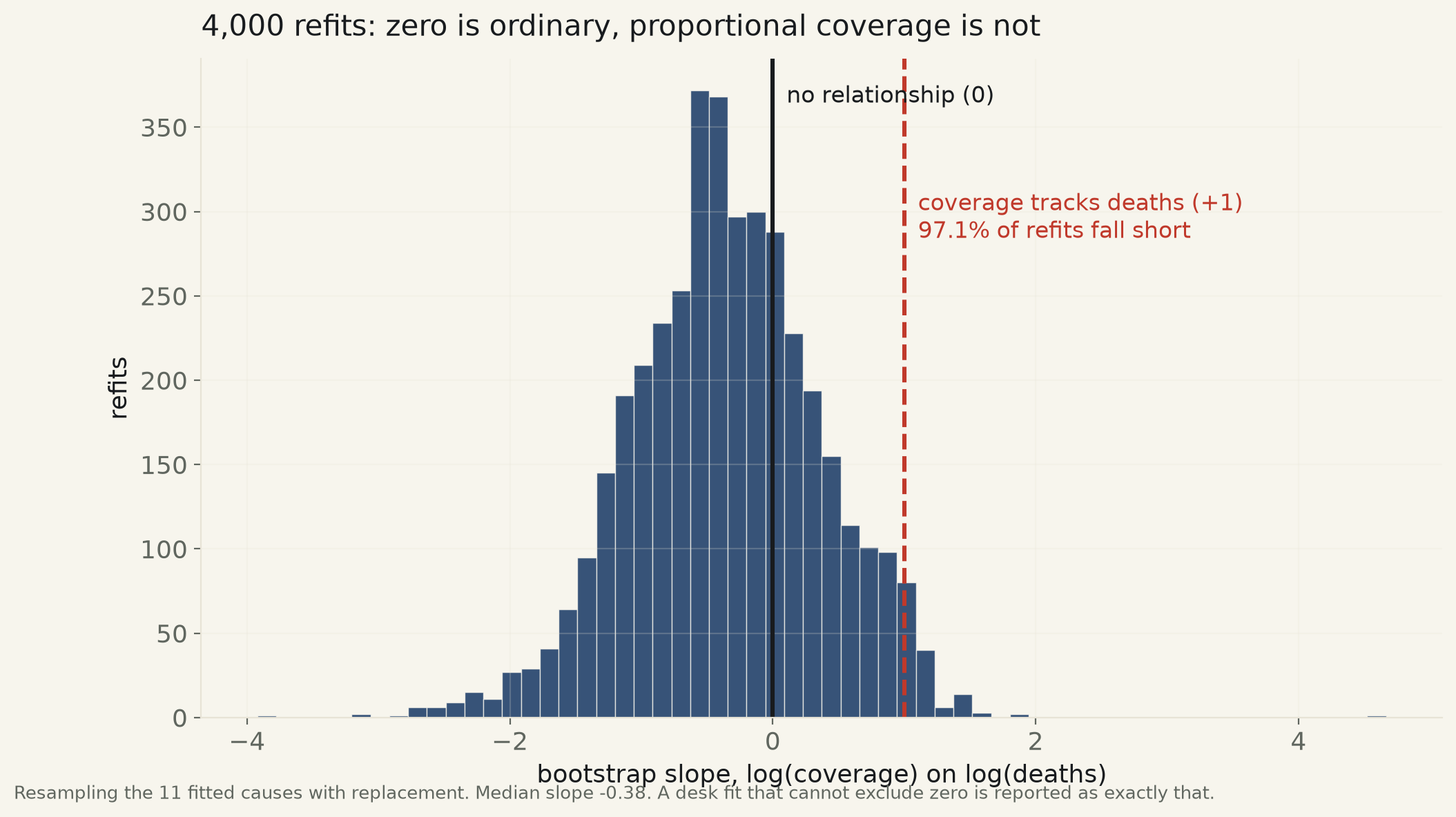
The fit says what the table says. Regressing log coverage on log deaths gives a slope of -0.363, 95% CI [-1.506, +0.779], R²=0.054, p=0.49. That interval contains zero, so by this desk's rule there is no relationship to report. It also excludes +1 — the slope coverage would have if it tracked mortality proportionally — which is the more useful half: the desk cannot tell you that coverage is unrelated to death, but it can rule out that coverage follows it. The rank correlation across all fourteen causes, zeros included, is +0.006 (p=0.99). Resampling the fitted causes 4,000 times, 97.1% of refits land short of +1, and the median refit is negative.
One model disagrees, and it is worth naming because it disagrees in the interesting direction. Fitted as counts with a negative-binomial family — the right family for data this overdispersed — the slope is -1.346, CI [-2.674, -0.018], p=0.047. That interval clears zero, barely, on the wrong side: it says the more a thing kills, the less it is named. A plain Poisson fit reports the same sign with far more confidence, and should be ignored — its dispersion is 51 where the model assumes 1, so its confidence is an artifact of the wrong family. The desk reports the negative result because it found it, and declines to lead with it, because a CI whose edge sits at -0.018 is not a finding to build on.
The result is not a channel's result. Fitted separately, every channel that named enough causes to fit produces an interval containing zero, and the three slopes disagree about sign. Whatever this is, it is not a house style. It is the shape of the medium.
| Cause of death | Americans killed, 2022 | Chyrons | Chyrons per million deaths |
|---|---|---|---|
| Heart disease | 704,786 | 1 | 1.4 |
| Cancer | 609,265 | 47 | 77.1 |
| COVID-19 * | 186,981 | 271 | 1,449.3 |
| Stroke | 165,726 | 2 | 12.1 |
| Chronic lung disease | 147,549 | 20 | 135.6 |
| Alzheimer's and dementia | 120,156 | 7 | 58.3 |
| Drug overdose | 109,360 | 2 | 18.3 |
| Diabetes | 101,390 | 1 | 9.9 |
| Kidney disease | 58,017 | 0 | 0.0 |
| Suicide | 49,674 | 6 | 120.8 |
| Flu and pneumonia | 47,163 | 2 | 42.4 |
| Car crashes | 46,550 | 9 | 193.3 |
| Sepsis | 42,349 | 0 | 0.0 |
| Homicide | 25,065 | 155 | 6,183.9 |
* COVID-19 is shown but not fitted — its 2022 toll belongs to a different disease environment than a 2026 news window, and its chyrons in this window are a Senate hearing, not health coverage.
| Channel | Slope | 95% CI | R² | p |
|---|---|---|---|---|
| CNN | +0.015 | [-2.156, +2.186] | 0.000 | 0.98 |
| BBC | too few causes named even once to fit | |||
| MS NOW | -0.034 | [-0.789, +0.720] | 0.003 | 0.91 |
| Fox News | -0.671 | [-1.640, +0.298] | 0.277 | 0.15 |
Three slopes, three signs, three intervals containing zero. The result is not a house style.
Method. Chyrons come from this desk's own Media Observatory capture of four channels. Each chyron is kept only if its timestamp falls inside a block the Observatory labelled program — not advertisement, not promo — which removed 7,620 chyrons. A keyword pass then removes advertising copy that bled across a block boundary, identified by the safety-disclosure grammar a drug advertisement is obliged to read out and a newsroom never writes. The window stops at 2026-08-04 rather than at the end of the capture because the Observatory's segmenter stopped producing block labels on that date; analysing the unsegmented days would have mixed labelled and unlabelled tape. A cause is counted once per chyron however many of its keywords match. Deaths are CDC/NCHS provisional monthly counts (resource 9dzk-mvmi) summed over the twelve months of 2022, the last complete calendar year in that series.
Two matching decisions that cut against the finding. The homicide keyword set is deliberately narrow — homicide, murder, stabbing, manslaughter — and excludes “shooting” and “killed,” which in this window are dominated by war coverage. The broad set would have counted 1,174 chyrons rather than 155, roughly eight times as many, and made the gap far larger. Suicide excludes “suicide attack” and “suicide bomber”; a suicide bombing is not a death in the CDC suicide row. Both choices shrink the effect reported here.
Limits, stated plainly. The mortality data is 2022 and the tape is 2026; the composition of American death is stable across four years for the large causes, but this is a gap and it is the run's main weakness. Twenty-one days is a short window, and it contains an active war, which crowds the agenda in ways a quiet month would not — though a war is a poor explanation for why heart disease was named once rather than fifty times. Chyrons are not the whole broadcast: a segment can run for six minutes under a banner that names nothing this run counts, so these are counts of naming, not of airtime. Keyword matching over OCR'd banners will miss some mentions and invent others; the matched text is published in full below so the counts can be checked by hand rather than taken on trust. And the deepest limit is the one the numbers cannot address: news is a record of what changed, and heart disease does not change. That is a real explanation for the gap. It is not a reason the gap does not exist, and a viewer calibrating their sense of danger from this tape would be calibrating it wrong.
chyron_mortality.csv · mortality_2022.csv · every matched chyron, verbatim · fit output (JSON).